WebStrategies had been around long enough to know exactly who they were. They were not a new company chasing a trend. They were not trying to become another vague digital agency with a modern logo and a promise to “drive growth.” They had more than two decades of real experience helping financial institutions make sense of marketing, technology, data, and operations.
But the name no longer carried the weight of what the company had become.
WebStrategies sounded broad. It sounded dated. It sounded like a company from an earlier version of the internet. The work had moved beyond that. The clients had changed. The category had changed. The ambition had changed.
The brand needed to catch up.

The result was GEEAR, a new identity built for a more focused kind of growth partner. One designed specifically for credit unions and community banks that need more than campaigns. They need alignment.
GEEAR is built around a simple strategic idea: when people, systems, and strategy work together, growth becomes less chaotic and more intentional. That thought became the foundation for the entire brand.
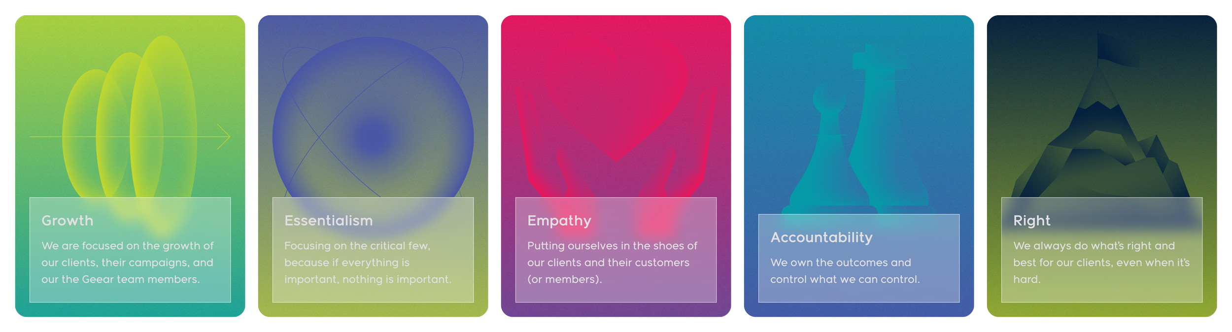
The name itself came from the company’s core values: Growth. Essentialism. Empathy. Accountability. Right. Five values. Five letters. One operating system.
Before the final mark came into focus, I explored a range of directions for how GEEAR could show up visually.
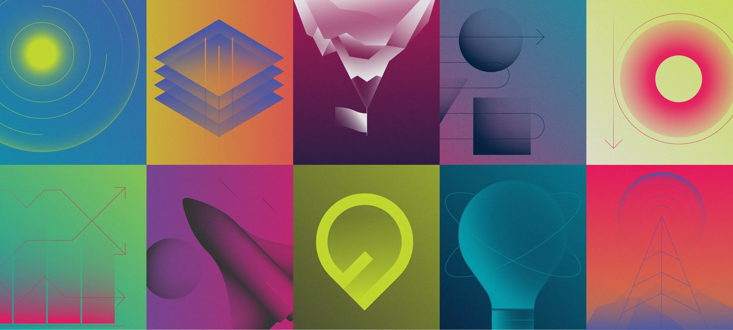
Some leaned into the idea of a signal. Some felt more modular and systemic. Others pushed toward motion, flow, and adaptability. The goal was not just to make a better logo, but to find a visual idea that could carry the strategy.
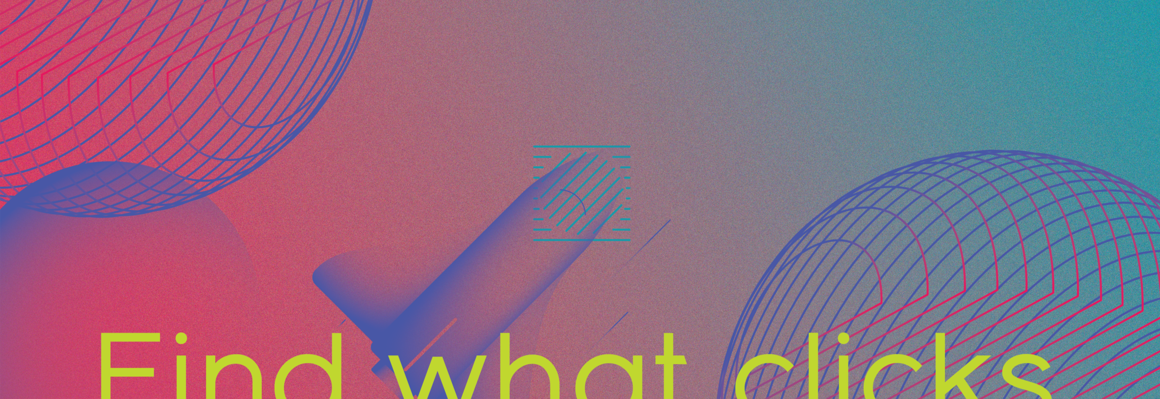
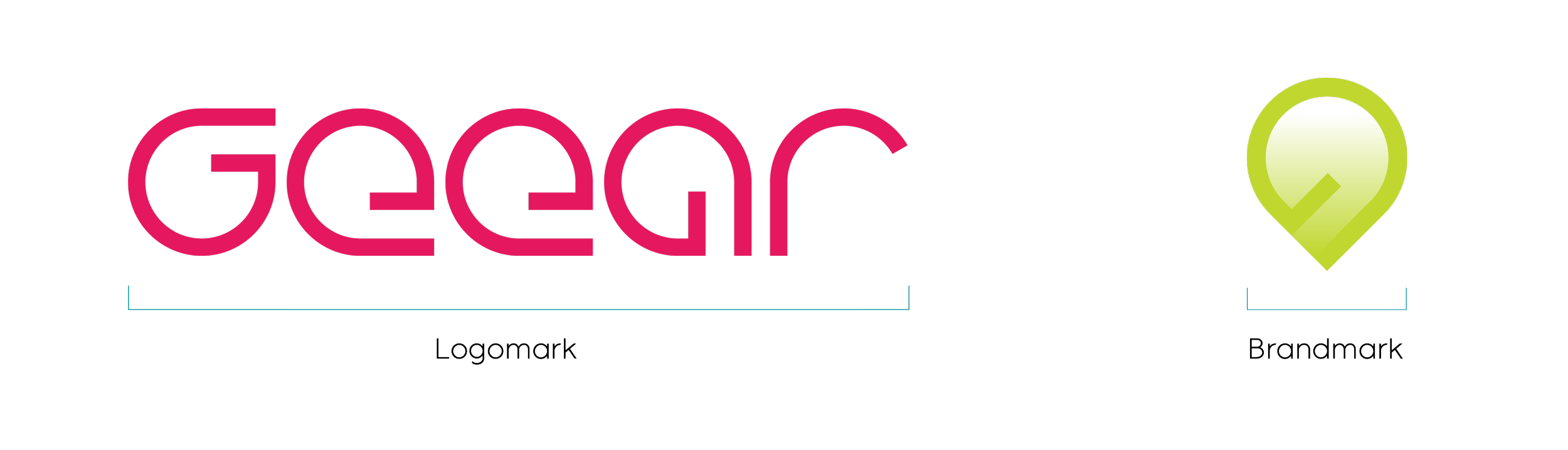
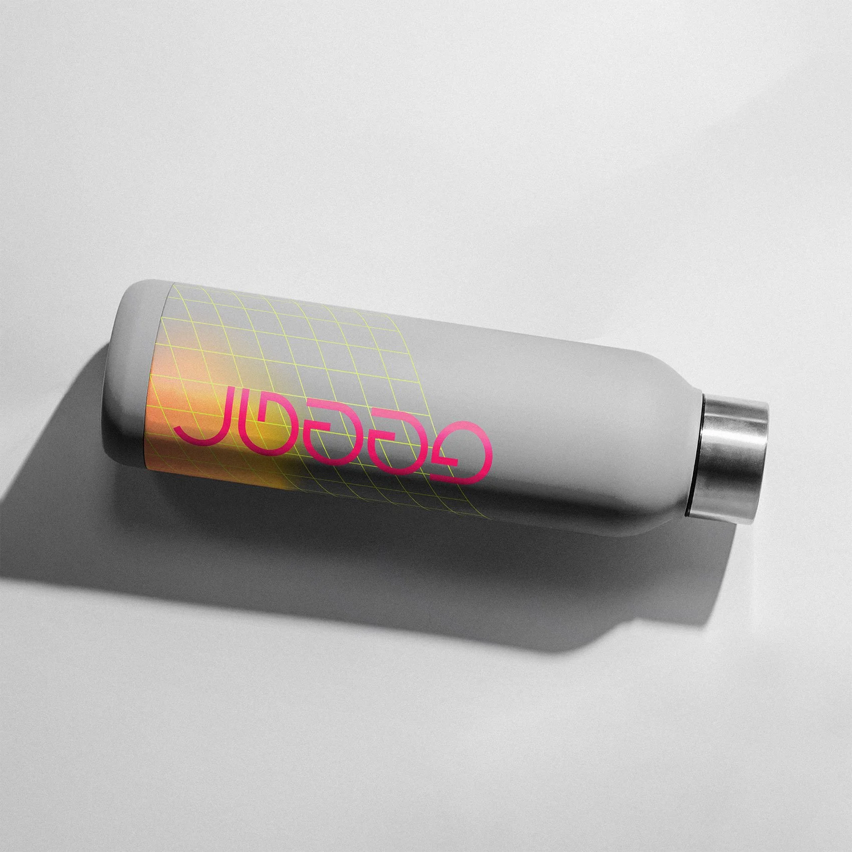
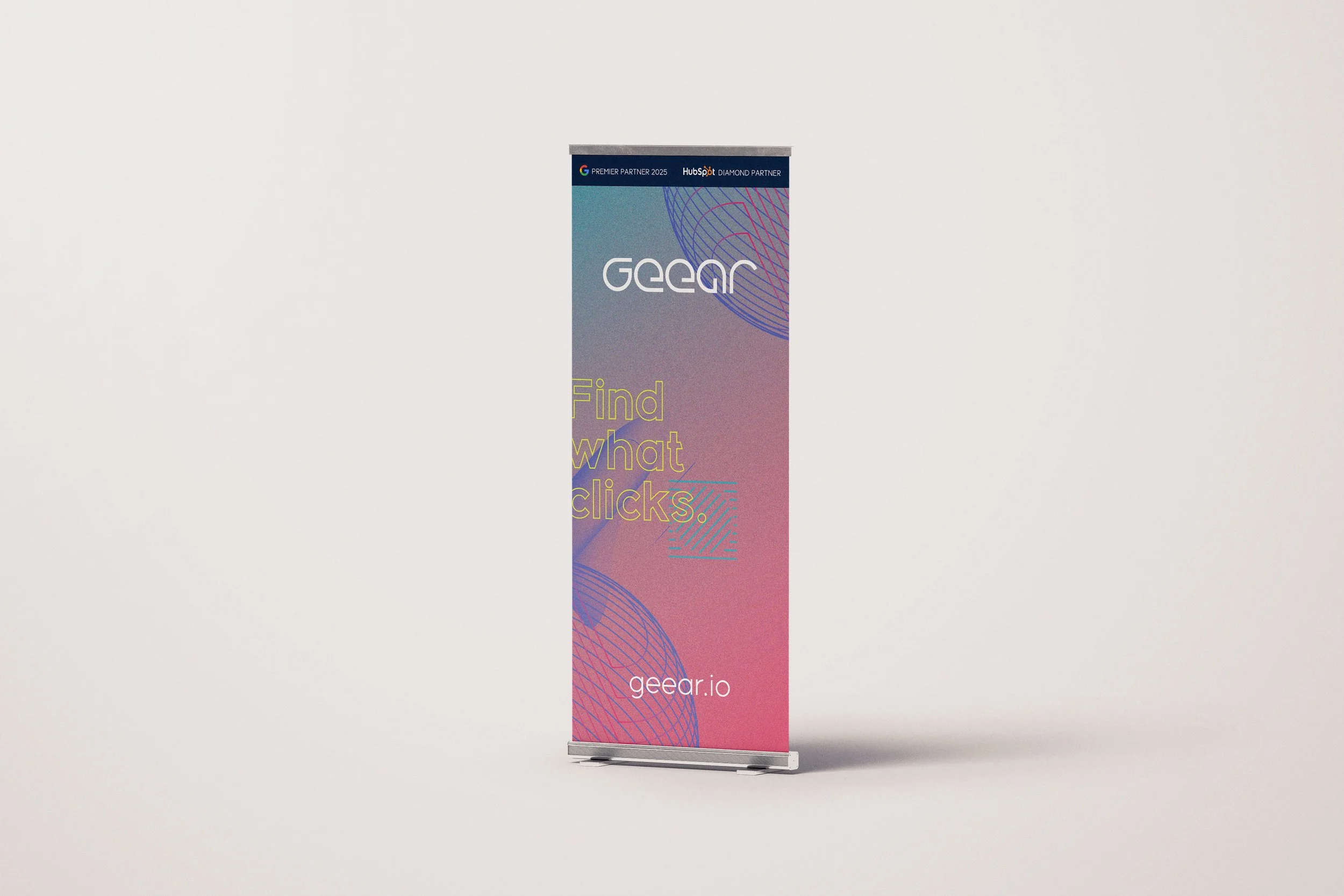
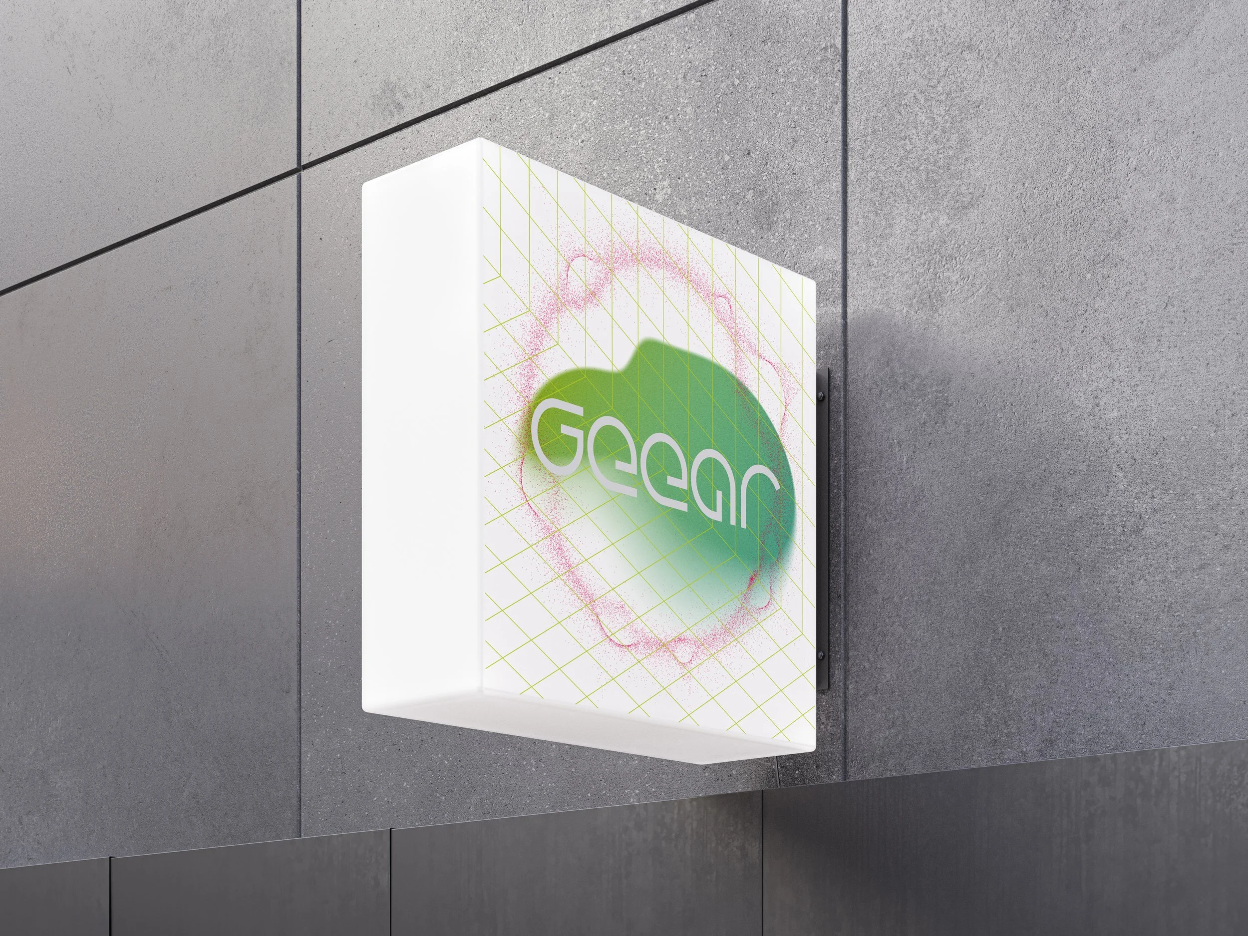
The final direction came from that search: a wordmark built from a repeated geometric form, each letter distinct but clearly part of the same system.
That modularity mattered. GEEAR is a company built around alignment, so the mark needed to feel like parts working together. Precise, but not cold. Technical, but still human. Distinct enough to stand apart from the safe, expected language of financial services.
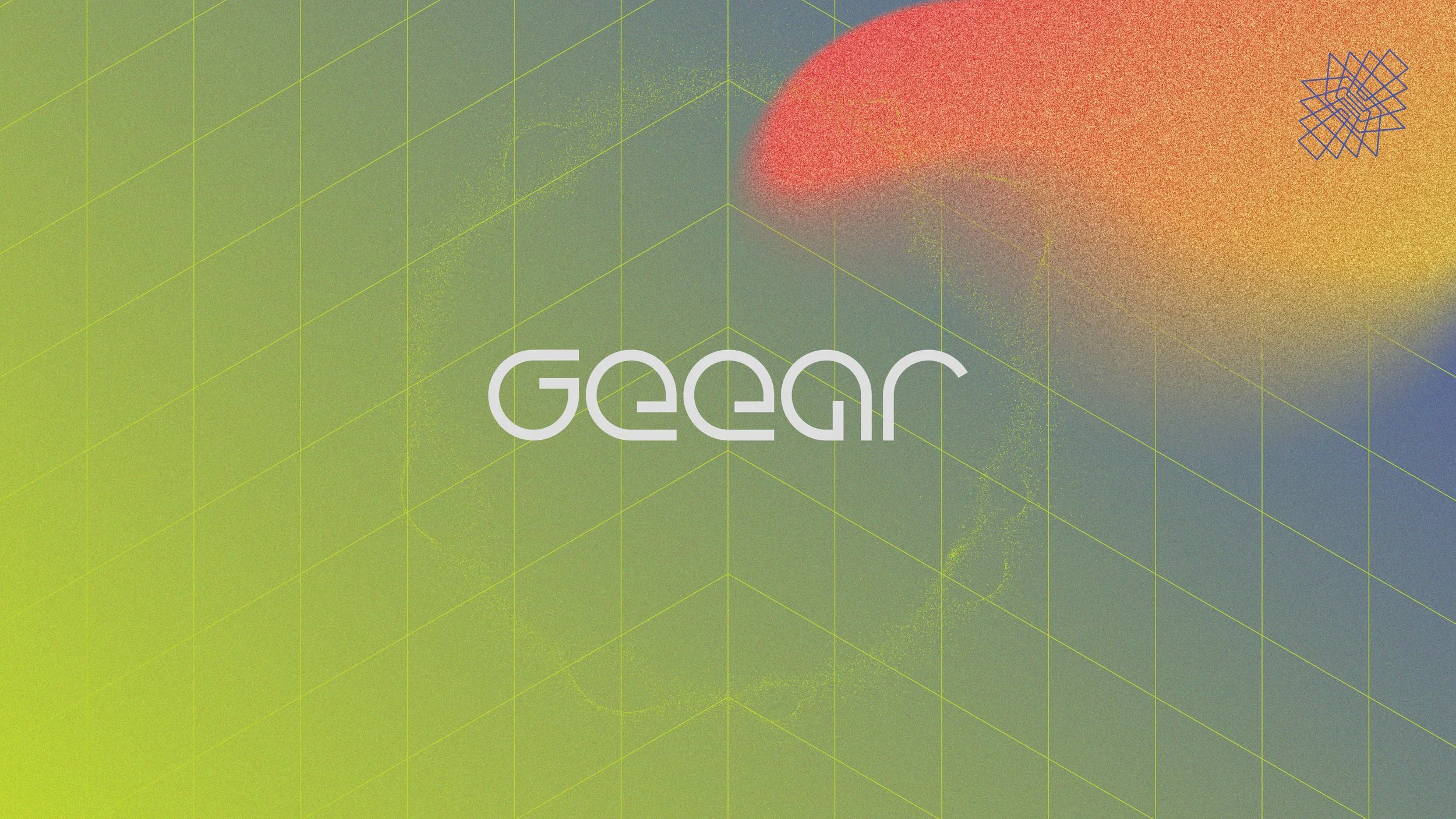
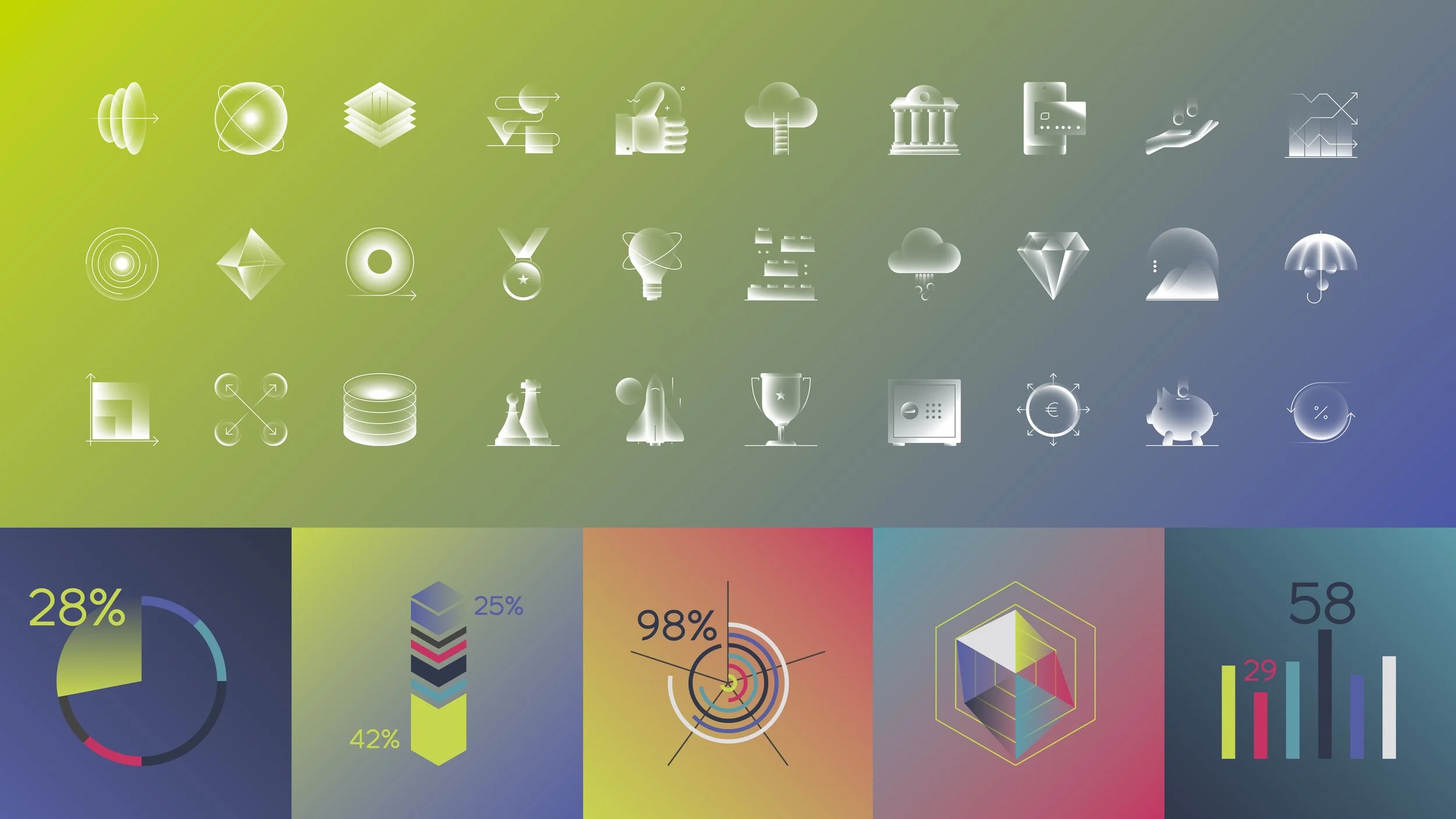
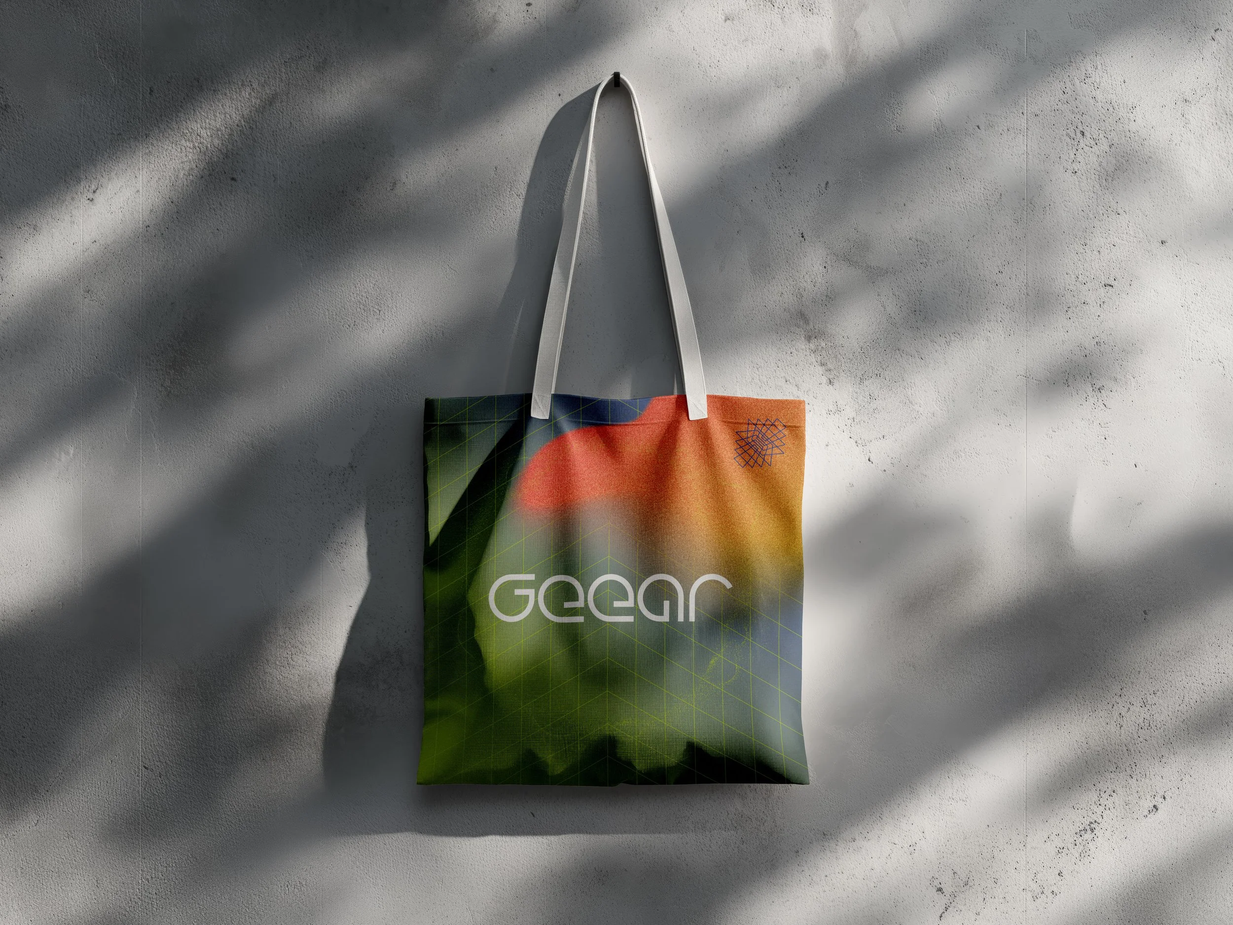
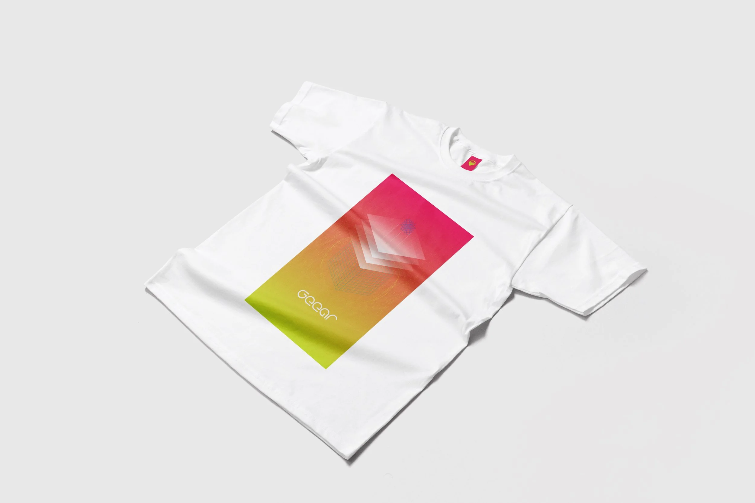
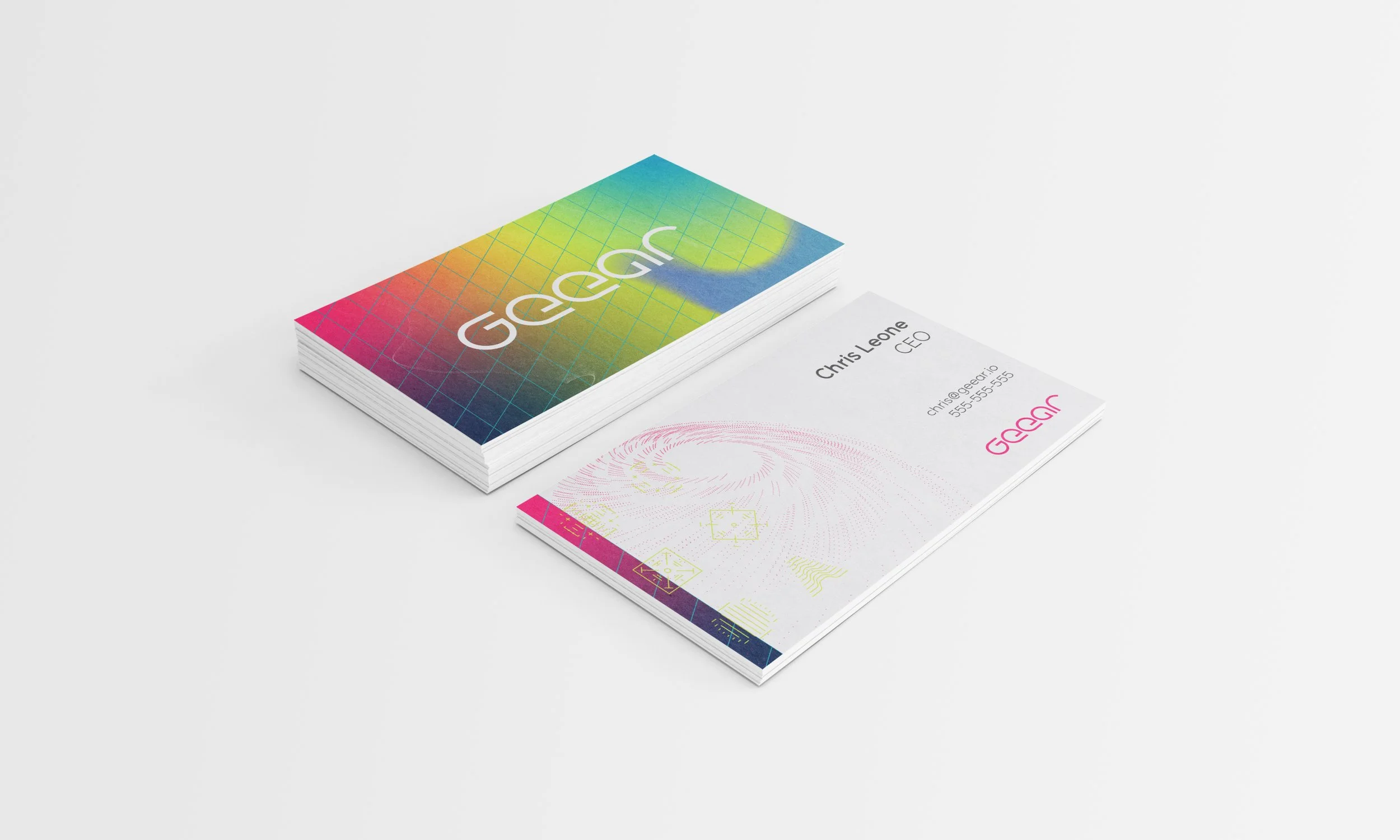
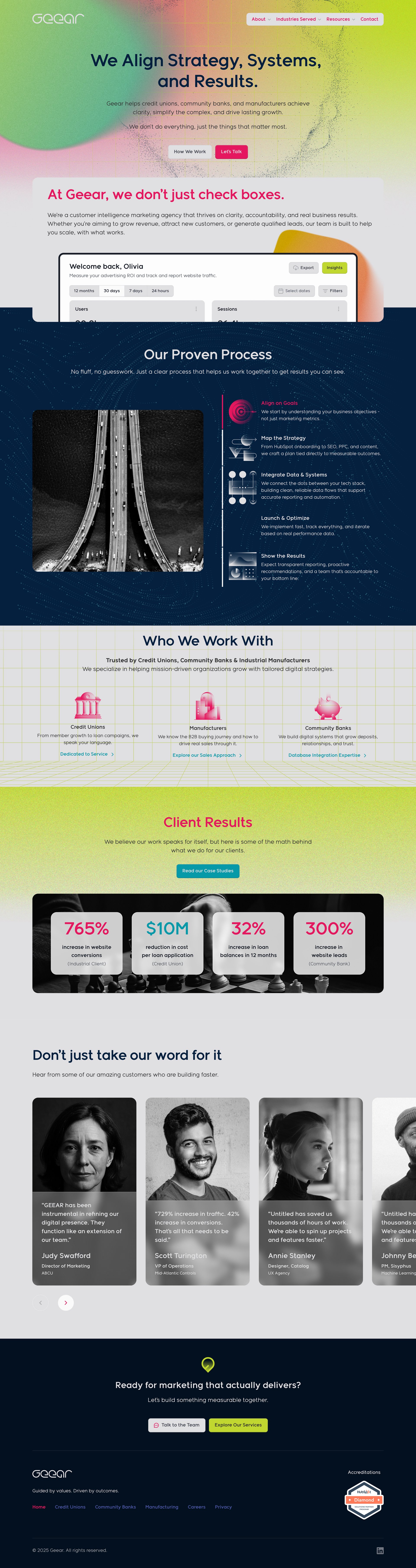
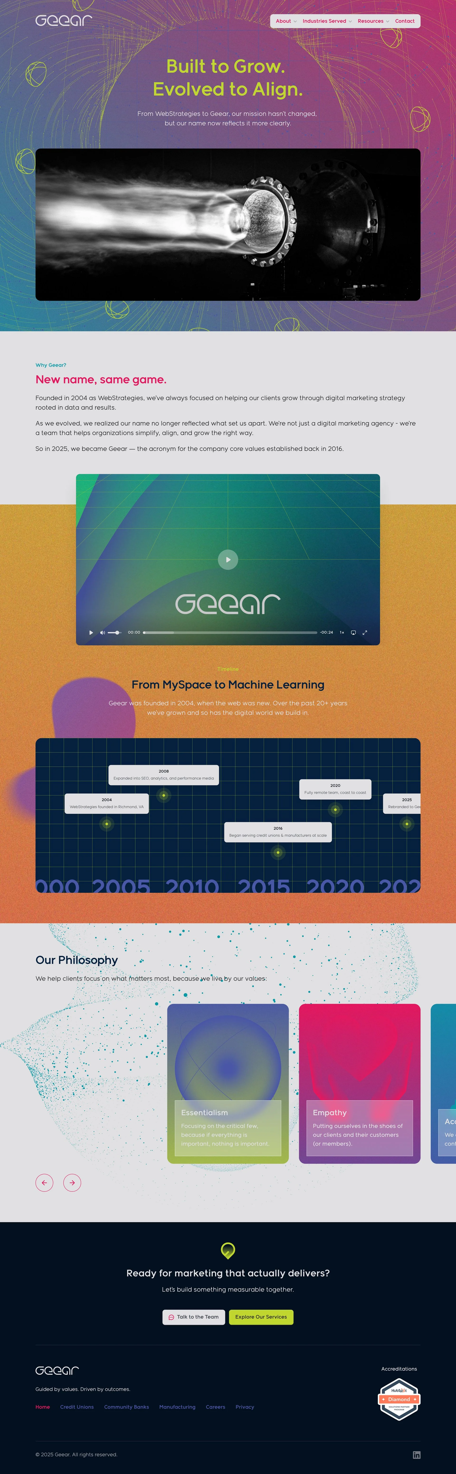
From there, the identity expanded into a broader system: vibrant color, dimensional forms, grid structures, graindients, black-and-white photography, and a voice built around clarity.
The palette was intentionally more energetic than the category. Credit unions and community banks are often surrounded by the same conservative visual language. GEEAR needed to feel credible, but not invisible.
The system gave the brand flexibility. It could be clean and restrained when it needed to be, then bold and expressive when the moment called for it.
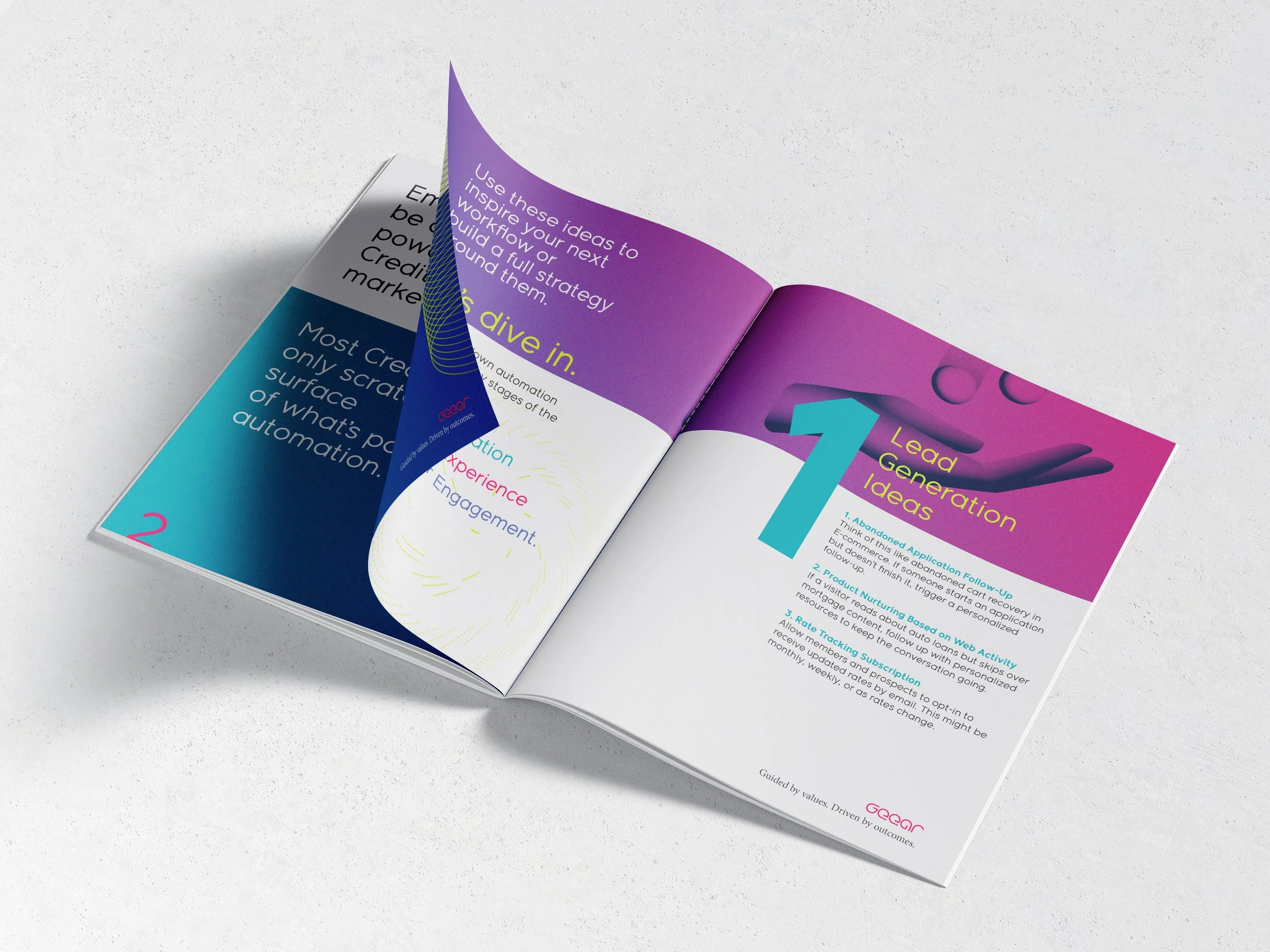
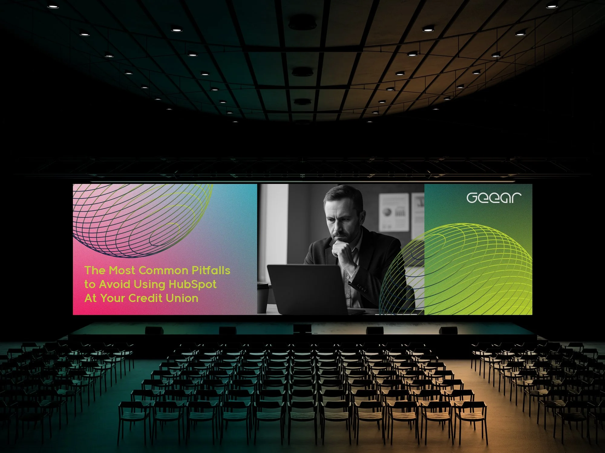
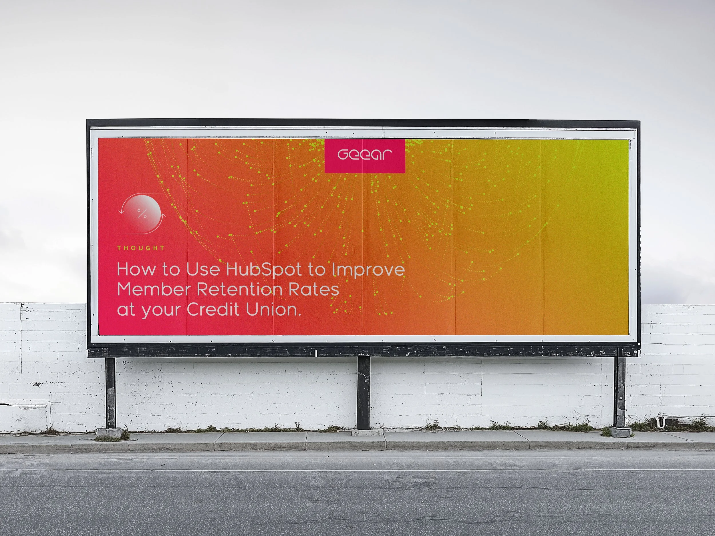
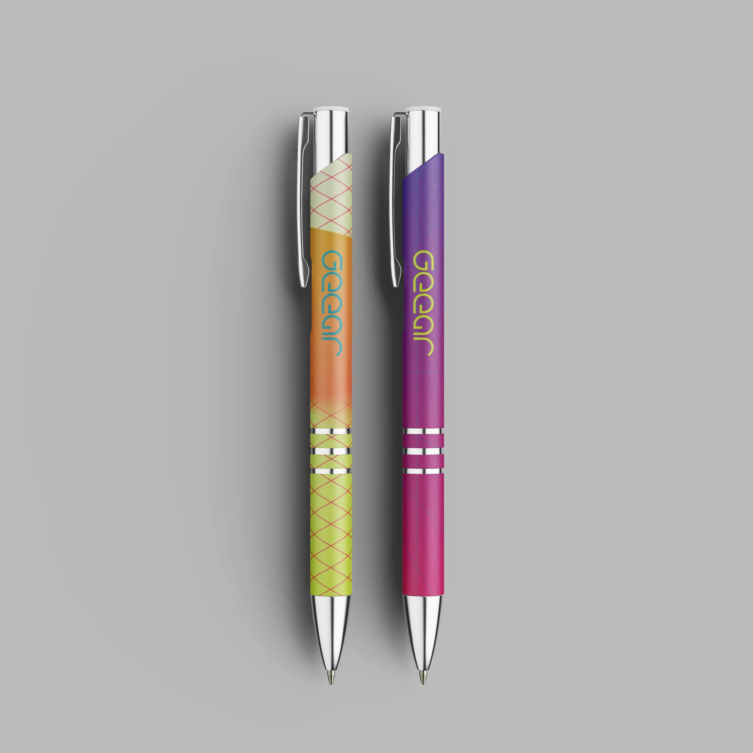
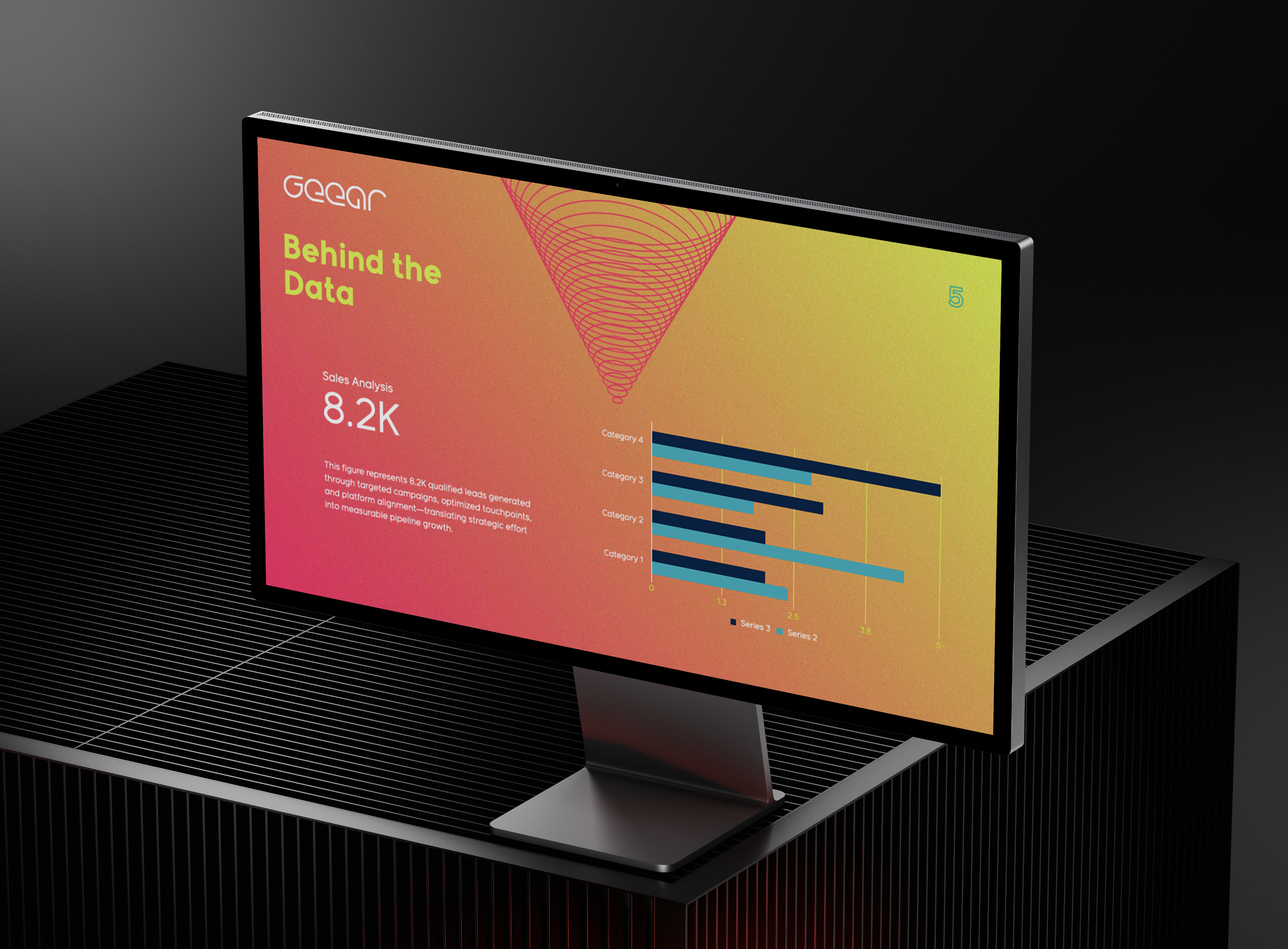
Once the core identity was established, I built out a full range of in situ applications to show how the brand could live beyond a guidelines document. Large-format displays, event graphics, presentation systems, brochures, signage, apparel, bags, bottles, and smaller branded details all became part of the same visual world.
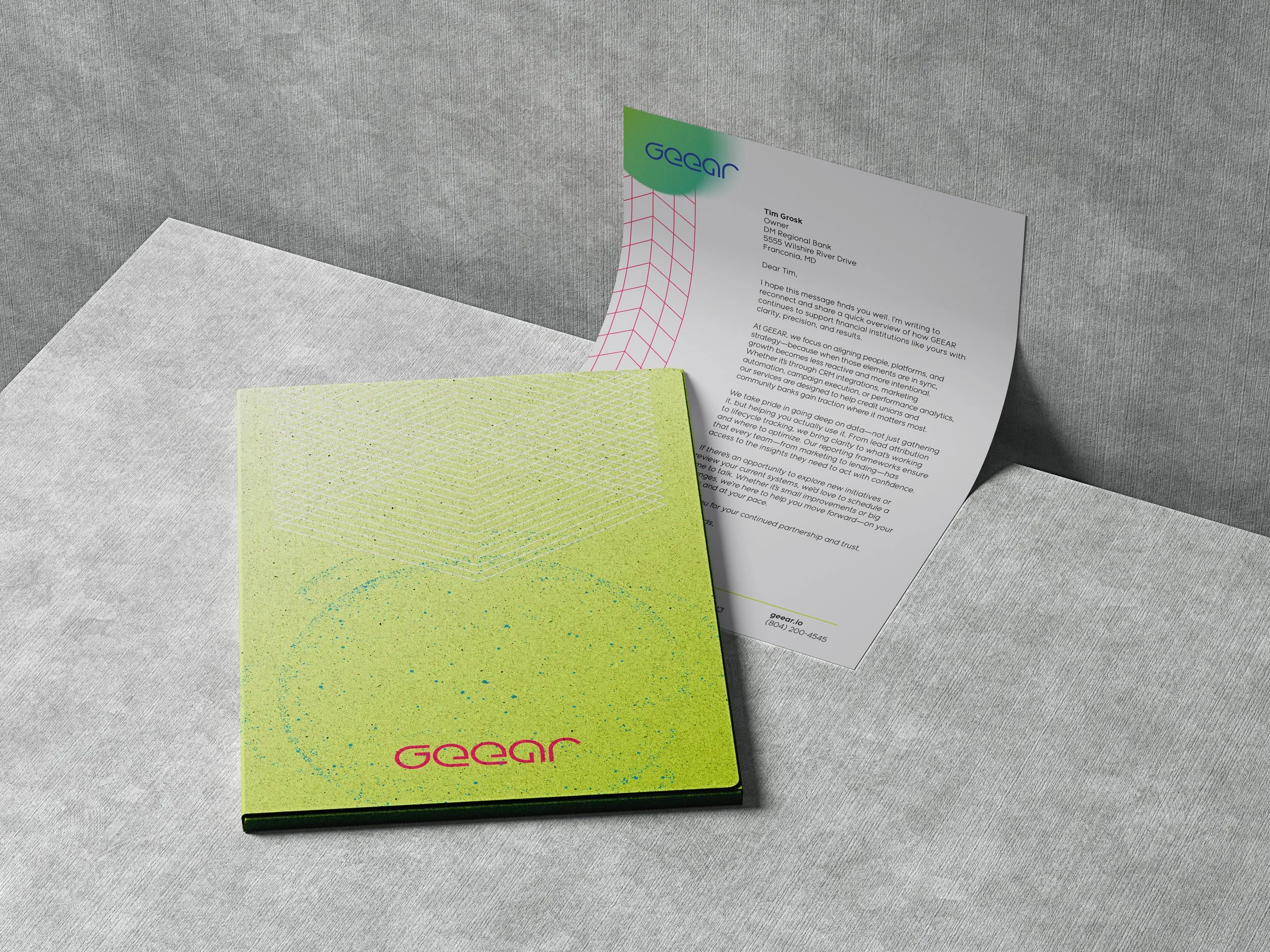
The point was not to make everything match. It was to make everything feel aligned.
A conference screen should feel related to a business card. A tote bag should feel related to a website module. A sales brochure should feel related to a billboard. Different formats, same signal.
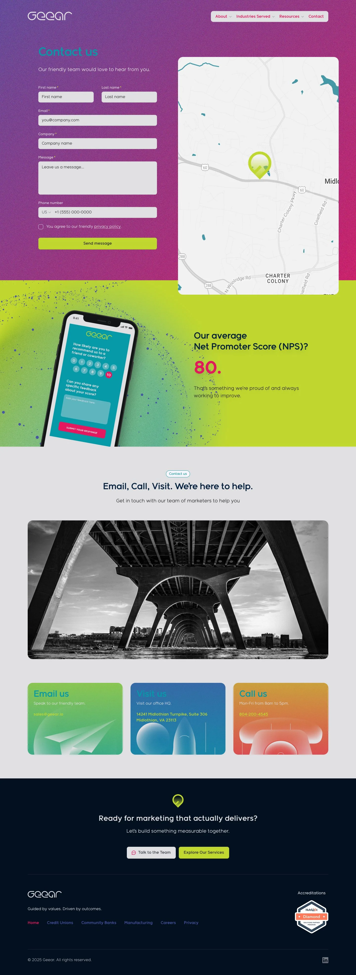
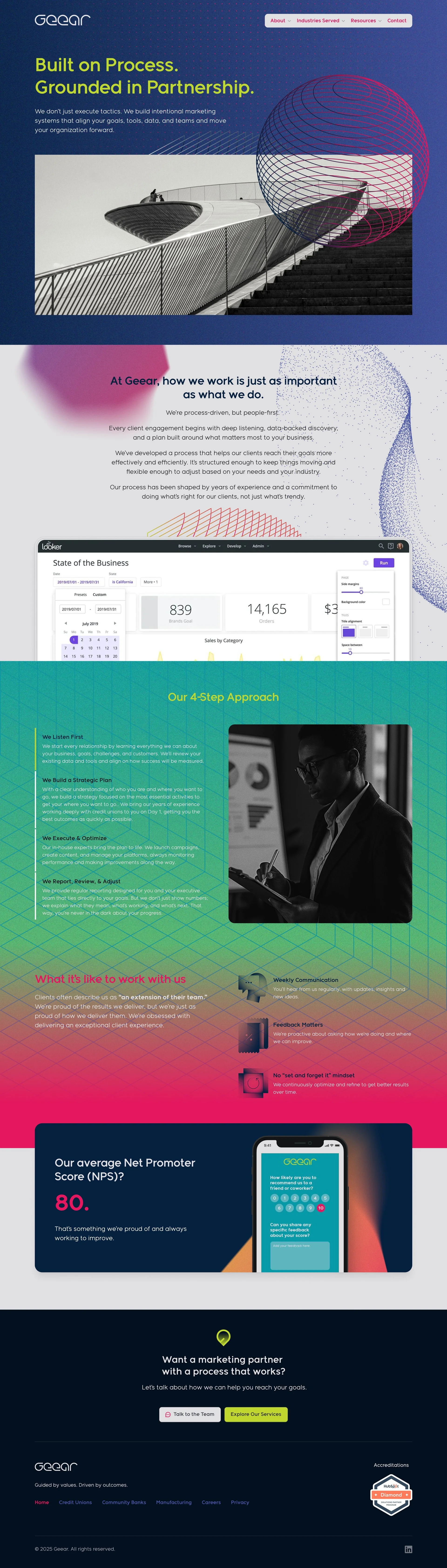
The final step was bringing the new identity into the website.
To make the system usable beyond the initial launch, I also created a comprehensive brand guidelines document covering strategy, voice, logo usage, typography, color, photography, graphic elements, applications, and implementation standards.
It gave GEEAR more than a new look. It gave the team a practical operating manual for staying consistent as the brand moved into sales materials, events, presentations, recruiting, and the new website.
The result was a complete identity system for a company ready to show up with more clarity, confidence, and focus.
A sharper name.
A stronger system.
A brand built to align.